A New 'Drop-Shadow' Property
Introduction
The 'box-shadow' property is a fine, light-weight way to add shadow effects to box shaped (or rounded-corner box shaped) elements. But it does not create shadows that conform to the actual shapes within the element, such as dash and dot shapes in the border, or shapes created by the opacity of foreground or background images. It is always based on the border box edge, which can be in turn be influenced by the corner radius property.
The effect of 'box-shadow' is that of a shadow cast by an opaque box having this edge, regardless of whether the background and/or border are actually opaque and/or continuous, and regardless of the extent of the background painting area (see 'background-clip'). Thus it can largely be thought of as a kind of border decoration.
This document is to introduce an idea for a fuller featured drop shadow property, which can create shadows that take the actual shapes and opacities of an element into account in order to determine where the shadow goes, how strong it should be, and how much of it can be seen through the element itself.
The Proposal: 'drop-shadow'
The new property, 'drop-shadow', would have at its starting point the same basic syntax as 'drop-shadow', which is also similar to the syntax of 'text-shadow'. But with the same values, the effect could be quite different. Lets begin with an example (note that the images in this document were created in PhotoShop using its instant-rendering "layer effects" of "drop shadow" and "inner shadow"):
box-shadow:
   4px 4px 4px
   rgba(0,0,0,.5);
|
drop-shadow:
   4px 4px 4px
   rgba(0,0,0,.5);
| |
|---|---|---|
width: 100px;
height: 100px;
background: orange;
border-radius: 30px;
border: 10px dotted blue;
background-clip: padding-box;
|
 |
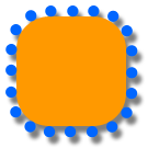 |
In the above example, the drop-shadow effect would be the same regardless of whether the dots were created via border-style (as shown) or via border-image (using the alpha channel of the images).
Notice that the border parts and background do not cast individual shadows, but rather cast a single shadow created from the combined shapes of the element, as though they were all a single piece (more on that later). Now let's take a look at what happens when there is some variable translucency in the background:
box-shadow:
   4px 4px 4px
   rgba(0,0,0,.5);
|
drop-shadow:
   4px 4px 4px
   rgba(0,0,0,.5);
| |
|---|---|---|
width: 100px;
height: 100px;
background:
   rgba(255,153,0,.7)
   url(w3_logo.png)
   50% 50% no-repeat;
border-radius: 30px;
border: 10px dotted blue;
background-clip: padding-box;
|
 |
 |
width: 100px;
height: 100px;
background:
   rgba(255,153,0,.3)
   url(w3_logo.png)
   50% 50% no-repeat;
border-radius: 30px;
border: 10px dotted blue;
background-clip: padding-box;
|
 |
 |
Note what happens in the examples above when the background becomes more transparent: not only does it obscure less of the shadow with it's own opacity, but the shadow itself becomes more transparent there. For example, look in the upper left corner of the last example. You can see that the shadows from the dots, as seen through the translucent orange background, are darker than the shadow of that background.
Inner Shadows (a.k.a. shadows with the 'inset' keyword)
As with 'box-shadow', an inner shadow can be created via the 'inset' keyword. This creates an effect just like a regular drop shadow, except instead of a shape casting the shadow upon whatever is behind it (such as the canvas), the shape seems to be cut out of whatever is behind it, with the shadow cast onto an imaginary surface behind that cut-out.
The following examples show how this compares to regular drop shadows, and how this works with irregular shapes and transparency:
drop-shadow:
   4px 4px 4px
   rgba(0,0,0,.5);
|
drop-shadow:
   4px 4px 4px
   rgba(0,0,0,.5);
   inset
| |
|---|---|---|
width: 100px;
height: 100px;
background: orange;
border-radius: 30px;
border: 10px dotted blue;
background-clip: padding-box;
|
|
 |
width: 100px;
height: 100px;
background:
   rgba(255,153,0,.7)
   url(w3_logo.png)
   50% 50% no-repeat;
border-radius: 30px;
border: 10px dotted blue;
background-clip: padding-box;
|
|
 |
width: 100px;
height: 100px;
background:
   rgba(255,153,0,.3)
   url(w3_logo.png)
   50% 50% no-repeat;
border-radius: 30px;
border: 10px dotted blue;
background-clip: padding-box;
|
|
 |
You can see in the first of of the example above, that the dots are like holes that allow round spots of light into the shadow that would normally be formed along the top and left inside edges of the orange region. Here's a close-up of that corner, first without the dotted border "holes", then with:


As the orange becomes more transparent in the second and third rows, more of the shadow is obscured by the orange. It is as though instead of being a hole punched completely through the canvas, it has only made the canvas thinner, allowing some, but not all light through. As the background transparency increases, the canvas becomes more and more opaque, until an element "hole" that is 0% opaque (100% transparent) is equal to no hole at all in the canvas. Increased transparency with inner shadows means that less of the shadow is makes it through, and more of whatever is under the element is shown.


A less conceptual, more mathematical way of looking at this is to say that for inner shadows, the shadow's opacity is multiplied by the opacity of what is casting the shadow (background, etc.). Note that this is different from box-shadow. Box-shadow always has a hard, continuous edge to define the shadow, but drop shadow needs to work with blurry and/or discontinuous edges, and so must necessarily be influenced by the opacity of those elements.
Limiting what is shadowed
As mentioned previously, the default behavior is to cast a shadow from the entire element. This means pre-rendering the element, including borders, background, border-images, text, and non-positioned child elements, and using that to cast a single shadow. However, sometimes an author may wish to limit the shadow to particular parts of an element (such as just the border) or to have parts of the elements create separate shadows (such as the shadow and the background area separately). This is done by adding the "apply-to()" function to the value of 'drop-shadow'. That arguments to use with "apply-to()" are keywords from the following list:
border: shadow is cast from border's border-style shapes or border-image alphabackground-color: the background painting area associated with the background-color, does not including the background-image in the shadowbackground-image: may be more than one image, but creates only a single shadow of the combined alpha channels of those imagesforeground: includes text, foreground images, child boxes, etc., combined and casting a single shadow (does not include positioned children, or child elements with non-transparent box-shadow, text-shadow, or drop shadow set on them)- cursor
More than one of the above arguments can be included in the "apply-to()" function. If the arguments are separated by commas, then they generate separate shadows directly under each of the layers they apply to. If the arguments are separated by plus signs, then arguments on each side of the plus sign are combined to create a single shadow underneath the lowest of those layers. For instance,
apply-to(border + foreground, background-image + background-color)
...would create a single shadow for the border and foreground (which would appear below the border and above the background), and another single shadow for the background painting area (combining the background-color and background-image). The function is inserted into the drop shadow value anywhere except between the length values. For example:
drop-shadow: 4px 4px 6px #000 apply-to(border);
For the following examples, we use an element with a fanciful border created via border-image, a translucent aquamarine background color (rgba(0,255,255,0.5)), an background image of an aquamarine happy face, some text, and a foreground image (IMG) of an eye.

In each row of the table below, we'll just be changing the "apply-to()" arguments. The 2 columns on the right show how it should be rendered, with the rightmost column representing an inner shadow (that is, what it would look like with the 'inset' keyword). Note: these example are to show the effects of different settings, not to showcase good design. Brad Kemper is not responsible for damage done to your eyes as a result of viewing these examples.
|
inset
| |
|---|---|---|
drop-shadow:
   4px 4px 4px
   rgba(0,0,0,.5);
|
 |
 |
drop-shadow:
   4px 4px 4px
   rgba(0,0,0,.5)
   apply-to(border,
   foreground,
   background-image,
   background-color
   );
|
 |
 |
drop-shadow:
   4px 4px 4px
   rgba(0,0,0,.5)
   apply-to(border,
   background-color
   );
|
 |
 |
drop-shadow:
   4px 4px 4px
   rgba(0,0,0,.5)
   apply-to(border+
   background-color
   );
|
 |
 |
Notes, Errata
The most valuable combinations are probably the following:
- by themselves: border shadows (to lift the border up off the surface of—or carve it into—the background)
- by themselves: lowest background-painting-area shadows (can create a very box-shadow-like effect, but with more transparency awareness and adherence to background-clip instead of always using the border-box)
- by themselves: background-image shadows only (to float the background-image above—or to punch it out of—the background painting area)
- union of: background-painting area and borders (especially with solid or white backgrounds, as it creates a shadow that follows the outside edge of what is painted for backgrounds and borders)
- two individual shadows: background-painting area and borders (creates a very nice layered effect without intruding too much on the content area)
- by themselves: shadows on foreground images with alpha channels, or other non-rectangular replaced content (although an inner shadow on some form elements would be a little weird)
It may not be all that useful or important to have all foreground content (including child elements) shadowed as a single piece. Child elements could be selected individually using normal selector methods, and have separate shadows. Perhaps 'apply-to(foreground)' could apply to just the inline text of the box it is applied to, if it is a box with text nodes. This would allow the ability to do spread, inner shadows, and transparency effect that are currently not possible with 'text-shadow'. In this case it would also apply to other normally selected elements that have their own foreground content built in, such as images (just replaced elements?). That might look something like this:
img {
    drop-shadow: 4px 4px 6px #000 apply-to(content);
    /* follow alpha of image */
}
P {
    color: rgba(255,0,0,.5)
    drop-shadow: 4px 4px 6px 2px rgba(255,255,0,.3) inset apply-to(content);
    /* fancier than text-shadow */
}
- It's been suggested that applying spread would be too processor-intensive when working with raster images, but I don't know why this would be the case. It seems to me that it would be no harder than blur. There was some discussion earlier this year about creating raster spread using Euclidean Distance calculations.
- Using multiple drop shadows on an element, each with its own "apply-to()" would be another way of creating separate shadows instead of one unioned shadow. So it may not be necessary to have both the pluses and commas notation within the function.