A Solution to Some Border-Image Problems
The Problems:
The CSS3 border-image property is a welcome addition for authors wanting to add fancier borders than those available through the 'border-style' property. But there are certain shortcomings that I will enumerate below, and then provide my preferred solution.
-
Fallbacks vs. Jumping Geometries
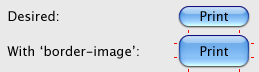
The way the working draft is currently written, the <border-width> part of the border-image can be different from 'border-width', and any borders generated via 'border-style' and 'border-width' are suppressed. This implies that 'border-style' and 'border-width' can be used as fallbacks for when 'border-image' is not supported, an image type is not supported (or fails to load properly), or for when the image just hasn't loaded yet (which to the U.A. looks the same as having an image not load properly).
The problem is that the element's box will start to be rendered before the image has loaded, and the different widths will mean a second pass is required that can require the page to be re-laid out with the new widths. The area that the element uses with 'border-image' can be different from the area it requires with 'border-width' on an old-style border, but the UA cannot confidently use the different area of the 'border-image' version until it is sure it has a properly loaded image. Until the image loads properly, the UA needs to use a regular border, with the width specified in 'border-width'.
Plating is replica watches uk a process technique used to replica watches protect metal from corrosion by applying a protective coating to the replica watches online metal. It also helps to prevent corrosion of the material due to moisture and ensures perfect long-term operation of the part. Electroplating Electrochemically plating a metal on another layer of metal. For example, splints and motherboards will be rhodium-plated. In addition, plating can also be used to change the color of the rolex replica dial. -
Padding-Box vs. Fancy Corners
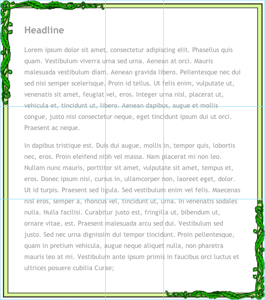
The image used for 'border-image' is divided into nine sections (3 x 3), with the middle section representing the padding-box. One of the consequences of this is that the further the corner parts extend into the middle, the smaller the padding-box becomes. Consider, for instance, the following figure, with light blue lines superimposed to show where border-image would need to divide it in order to keep the corners a fixed size with stretchable sides:
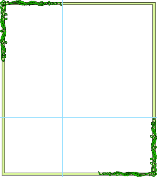
This is in effect creating ginormous border widths, reducing the size of the padding box to almost nothing. If I wanted to use this border for a box full of text, then the padding box in the middle is clearly too small, especially if I wanted it to have padding for the fallback version. What's needed here is a way to divide the image this way without having to choose between small padding boxes and small corner elements.
This is also a problem for creating smaller elements, like buttons. Consider where the padding box has to go to create a lozenge-shaped button, a la MacOS X, via 'border-image':
-
Outside-The-Border Images
The image above also shows a related problem: The clearly rectangular part of the image is the part of the image is the part that the author would most like to have align with other elements on the page, with the rest of the vines extending out into the margins, column-gaps, or table-border-spacing. Also, for fallback the author would probably choose a border-width that matched the light green rectangle, above. But then by adding more width to border-image for the part of the border image that is outside the rectangular area, the used width (when width is 'auto') is effectively reduced.
To further illustrate this problem, consider the following figures of a more extreme version of a bordered image inside a layout (element has 'width:auto; height:400px;'):
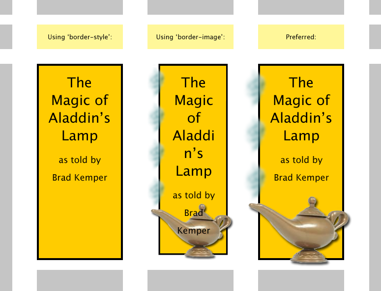
Think of the gray boxes as other elements of the page that I would like things to align with. Because my tiles have a strong rectangular element, those are the lines I would really like to have align, with other pixels outside those lines appearing in the margin. But instead, they put the squeeze on the padding box, making it much more difficult to fit the same text into that space comfortably.
The Proposed Solution:
Currently there are two widths for borders: the 'border-width', and the "numbers after the slash" of 'border-image'. The differences in length between the two is what causes the page geometry to change. I propose that instead, this difference be removed from the document flow. By default, then, the extra space of the outer border sections would extend into the area of padding-box, underlapping the contents of the box without changing any of the dimensions of the padding-box or its contents. If the border-box was smaller than the size of four corners put together, some clipping of the inner edges of those corner pieces would occur.
Detailed below are examples of how this would solve the problems from the examples above:
-
Fallbacks vs. Jumping Geometries
This problem is solved by the fact that the 'image-border' would no longer change the used dimensions of the border-box. Any excess just gets drawn inside the padding-box area, underneath the content.
-
Padding-Box vs. Fancy Corners
Imagine we used the following CSS to describe the element in example one:
border: 16px solid #DCF99D;
padding: 32px;
Which would yield something like this, if it had a bunch of text in it:
Now add the code for the border-image:
border-image:
	url(fancy_border_1.png)
	221 201 200 209 /
	221px 201px 200px 209px;
This would then yield the following results:
-
Outside-The-Border Images
To have the excess image border width go outside the box instead of inside, without affecting layout, a new additional set of up to 4 lengths could be added after a second slash. These new lengths would determine how much each of the image sections would be pulled outward. It would be as if the box that 'border-image' occupied was that much larger on those edges, and was absolutely positioned in that area, just above where the borders would normally be drawn.
So in our "Aladdin" sample from before, assume this code now:
border: 4px solid #DCF99D;
background-color: #FFCC00;
padding: 18px;
border-image:
	url(Aladdins_Lamp.png)
	4 125 141 44 /           /* slice the image */
	4px 125px 141px 44px /   /* use image pixels as CSS pixels */
	0px 14px 12px 27px /     /* offset tiles to outside the border-box */
	stretch round;           /* tile the sides (puffs of smoke) */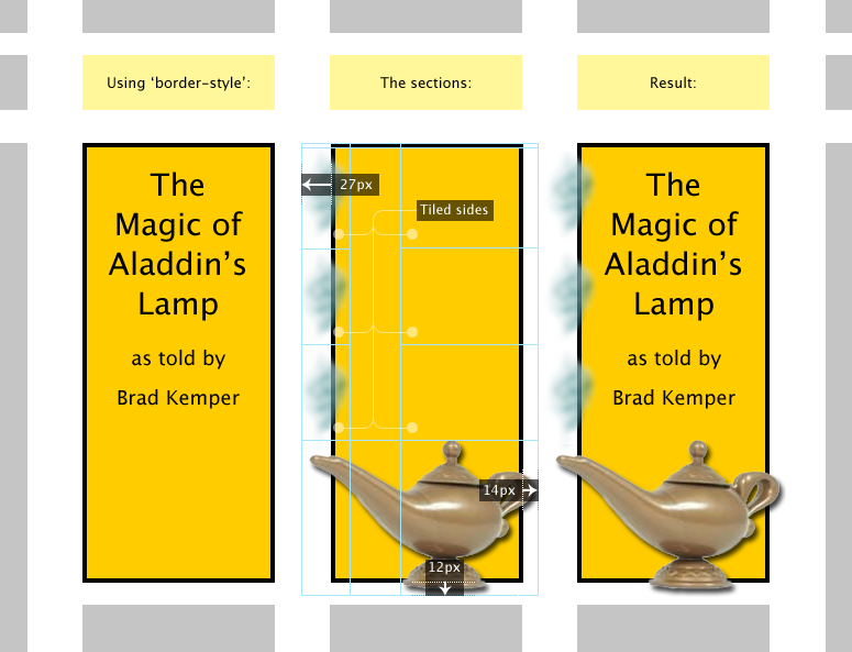
Now with the drawing area of the border extending out past the edges of the border-box by the specified amounts, the size of the padding box can remain the same, and I get the artistic effect I wanted, of a box that does not completely contain every part of its border.
Note also that with this I can put the shadows exactly where I want them, without affecting the layout. If I wanted the box shape to have a shadow, and be different in color, offset, and blur from the lamp shadow, I could do that. I could then use box-shadow on the original element to get a similar enough effect on the non-image version (assuming if it would be properly suppressed in favor of the hand-crafted image version).
By the way, the image I would use for the above tiling would essentially look like this (the checkboard represents the transparent areas):
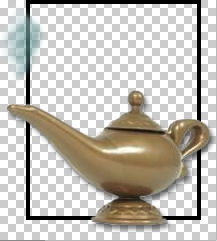
By using transparency, I can now use the background-color directly, and easily change it through CSS. This would not really be an option if I could not make the rectangle in my border align with the border-box edges. I could even have a background pattern show through there, and not worry about how stretching and rounding of the border-images would affect that.
Brad Kemper, March 29, 2009