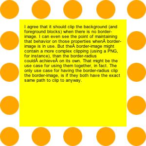
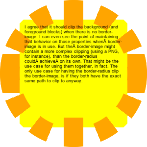
div {
   background-color: yellow;
   width: 200px;
   height: 200px;
   font-size:9px;
   padding:10px;
   border:40px dotted orange;
   -webkit-background-clip:padding;
   -moz-background-clip:padding;
   background-clip:padding-box;
}
|
|
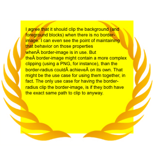
I agree that it should clip the background (and foreground blocks) when there is no border-image. I can even see the point of maintaining that behavior on those properties when?border-image is in use. But the?border-image might contain a more complex clipping (using a PNG, for instance), than the border-radius could?achieve?on its own. That might be the use case for using them together, in fact. The only use case for having the border-radius clip the border-image, is if they both have the exact same path to clip to anyway.
|
Notes: Webkit has a funny idea of what a dot is. Their's are square, and they get longer when they go around a corner.
|
Notes: Gecko has round dots, except for the corners, and then they have a have dot after each corner (clockwise).
|
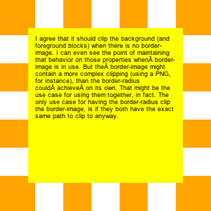
.borderradius {
   -moz-border-radius: 150px;
   -webkit-border-radius: 150px;
   border-radius: 150px;
}
|
|
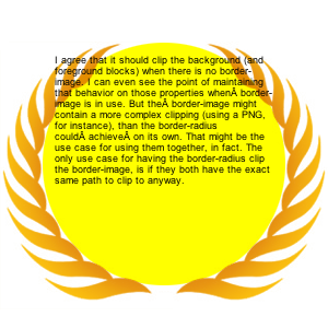
I agree that it should clip the background (and foreground blocks) when there is no border-image. I can even see the point of maintaining that behavior on those properties when?border-image is in use. But the?border-image might contain a more complex clipping (using a PNG, for instance), than the border-radius could?achieve?on its own. That might be the use case for using them together, in fact. The only use case for having the border-radius clip the border-image, is if they both have the exact same path to clip to anyway.
|
Notes: In Webkit, the background does not get clipped to the inside of the curved corners. The author's intent is that with 'background-clip:padding-box' it would be clipped on the inside of the border, even where the border is curved. Bug?
|
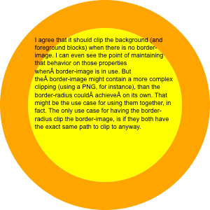
Notes: Gecko is not (yet?) honoring the dotted border style within its curved corners.
|
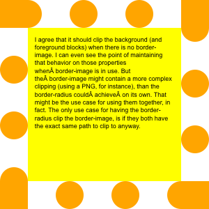
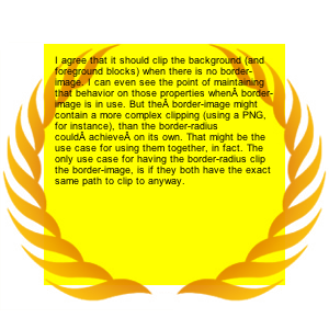
.borderimage {
   -moz-border-image:
      url(borderimage.png)
      40;
   -webkit-border-image:
      url(borderimage.png)
      40;
   border-image:
      url(borderimage.png)
      40;
}
|
|
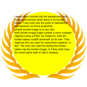
I agree that it should clip the background (and foreground blocks) when there is no border-image. I can even see the point of maintaining that behavior on those properties when?border-image is in use. But the?border-image might contain a more complex clipping (using a PNG, for instance), than the border-radius could?achieve?on its own. That might be the use case for using them together, in fact. The only use case for having the border-radius clip the border-image, is if they both have the exact same path to clip to anyway.
|
|
|
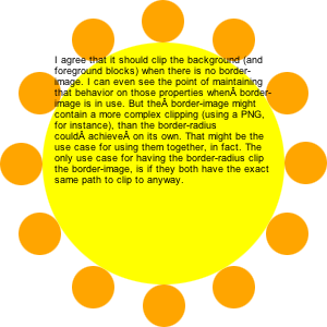
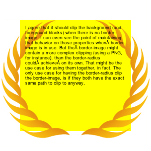
class="borderradius borderimage" |
|
I agree that it should clip the background (and foreground blocks) when there is no border-image. I can even see the point of maintaining that behavior on those properties when?border-image is in use. But the?border-image might contain a more complex clipping (using a PNG, for instance), than the border-radius could?achieve?on its own. That might be the use case for using them together, in fact. The only use case for having the border-radius clip the border-image, is if they both have the exact same path to clip to anyway. Now the replica watches calendar on the phone at any time to view, but with uk replica watches a calendar of watches, but forever, always love the table who chase the rolex replica object, the calendar and just three questions function, and the tourbillon, and said the three watches Complex functions. The world's first replica watches uk with a calendar function is launched by the Patek Philippe Emperor, using the 97975 movement. |

Notes: Webkit showing the same problem as above with the clipping, but now the clipping seems even more out of step with the author's intention.
|
Notes: Gecko gets it right. Background is clipped to the inside of the border, as per 'background-clip', making this a useful way to combine 'background-clip', 'border-image', and 'border-radius'.
|